Monday, 16 June 2008
Electronic'S - R - US

This is a horror show of a sign.
It always irks me how "toysRus" turned a repugnantly illiterate phrase into a brand name, so I obviously hate to see it copied. When combined with apostrophe abuse, this causes my eyelid to twitch à la the captain from Police Academy.
I post this in the knowledge that fellow GrammarBlogger Tom (should we begin to employ GrammarBlog as a surname when referring to a member of our fraternity?) will be horrified at yet another unwise application of the Bank Gothic typeface.
Labels: apostrophe, apostrophe abuse, bank gothic, marketing copy, punctuation, signage, Typography
posted by Gez at 9:58 pm
 7 Comments


Thursday, 20 December 2007
Grammar Abuse in signage: part 15
You've probably seen this as everyone in the world reads The “Blog” of “Unnecessary” Quotation Marks. If you don't, you should. 
I love to hate everything about this sign: the terrible typefaces; the indented first line; the incorrect tense; the misspelt three letter word; the weird hanging quotation mark; and finally the ambiguity. Am I to built my onw taco, or my onw taco bar?
It's up there with the worst sign ever.
Labels: menus, quote me happy, signage, spelling, Typography, wrong word
posted by Gez at 11:28 pm
5 Comments
Sunday, 29 July 2007
Typography Part 2
We covered the basics a few posts ago, so let's move on to some more detail.
There are many common typographical crimes, but one that irks me more than most is the brutal warping, squashing and stretching of type on the likes of signage and promotional 'literature'.
eg:

Typefaces are (most of the time) lovingly designed, with careful thought going into how each and every character interacts. You must not resort to stretching and warping them. Not only does it make your copy hard to read and mark you out as being a philistine, you're also ignoring the fact that typography provides you with lots of options in order to make the best, most readable and most aesthetically pleasing use of the space available.
The three key concepts are leading, tracking and kerning.

Leading (sometimes called 'line-spacing') refers to the vertical space between lines of text. Tracking (or 'letter-spacing') deals with the horizontal space between characters. Using the two with subtlety can make a huge difference to the legibility of the type you're working with. Kerning, however, is my personal favourite. This refers to how two individual characters appear next to one another. For example, a capital 'F' can sit physically closer to a capital 'A' than a capital 'L' , because the space between the edges of the letters is wider due to the 'A's tapered top.

Professionally-designed typefaces have kerning information built in; ie the type designer has been through every single combination of two letters, kerning them individually. Lovely stuff.
Labels: OCD, Typography
posted by Tom at 11:41 am
7 Comments
Thursday, 26 July 2007
Bank Gothic Burger
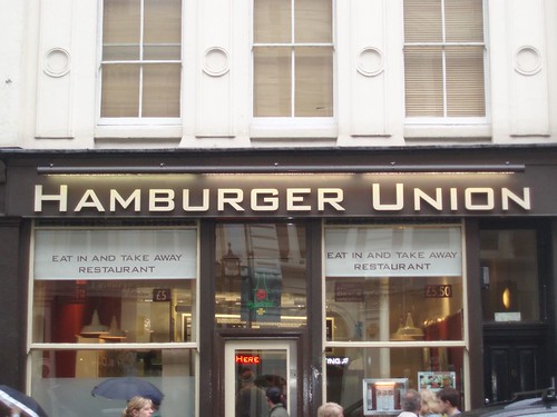
Now then, this is a bit of an experiment - it's not strictly grammar related but as Tom is well into typefaces I thought tickle his fancy and post this.
Bank Gothic has to be the most over-used typeface in the world. Ever.
You may have seen it recently adorning the credits and subtitles in the new Transformers film (which is amazing by the way), a setting where it is particularly suited as it implies a kind of nostalgic vision of the future. Like watching old episodes of Tomorrow's World in which a BBC presenter is claiming we will all live on the moon in 1995.
In fact, I can think of no other reason for using Bank Gothic unless you are Steven Spielberg or Michael Bay and you are making a film about a race of extraterrestrial robots based on a popular cartoon from the 1980s.
You certainly shouldn't use it as the sign for your hamburger restaurant.
Labels: bank gothic, photos, transformers, Typography
posted by Gez at 6:22 pm
7 Comments
Saturday, 7 July 2007
Typography Part 1
I mentioned way back at the start of this blog that I'd like to talk about typography, considering it is the vehicle that carries our blessed language.
My job involves designing and making things that people read, and admittedly I often bore people to death by harping on about how important typography is. But the key point here is that I'm not expecting everyone to become a graphic designer; what I would like to see is a greater appreciation of typefaces and how to use them properly, and rather less font-based barbarism.
So let's cover the basics, in easy-to-understand chunks. First up: serif and sans-serif.
The vast majority of typefaces (not "fonts" by the way - a font is the actual file; we should refer to "typefaces" when we're talking about the design or visual appearance) fall into two categories - serif and sans-serif. A "serif" is the decorative tail which appears on the end of certain characters. Times News Roman and Arial are the well-worn examples of each.

Sans-serif typefaces tend to be used for informal and/or contemporary design (eg. logos, signage or promotional literature), with serif faces being used to maintain (or contrive) a more traditional feel.
The general school of thought has always been that serif typefaces are slightly easier to read when used for large blocks of small, printed type - this is why newspapers and books are largely set this way - with sans-serif being more suited to small text on screen (due to the low resolution of monitors in comparison with print). This has changed dramatically over the last ten years, however, as monitors and computer type-rendering are getting more sophisticated - our lovely, crisp, serif-based GrammarBlog design being a good example.
If you're interested in the detail, there's lots of it over at Wikipedia.
Labels: Typography
posted by Tom at 11:30 am
5 Comments
Thursday, 17 May 2007
Single Breasted Womens Jackets
Single Breasted Womens JacketsAdmittedly, fashion marketing isn't my area of expertise but I wouldn't have thought there are enough single breasted women to create the demand for such an item. In addition there is a possessive apostrophe missing (grrrr).
Note: The plural of woman is "women". There is no plural of women so "womens" is never a word.
Technically, the header should have read:
Single-breasted, Women's JacketsI resisted the urge to suggest that it should be changed, partly because I don't want to appear anal and smug (unlike certain other GrammarBloggers) and partly because I suspected I would be overruled in the name of style.
The layout for this presentation was clean and uncluttered and the header would have admittedly lost some of its stylistic value if it had been interrupted with all that pesky punctuation.
So does that mean the laws of punctuation can be ignored in this case? Not under my hard-line dictatorship, that's for damn sure! Any arty types dropping apostrophes willy-nilly had better be prepared for the thumbscrews.
Leniency will be shown with regards to hyphens, they can be optional.
Labels: language, marketing copy, punctuation, Typography
posted by Gez at 3:35 pm
2 Comments
Saturday, 12 May 2007
Tom's Angle
Expect plenty of bilious posts, with lots of examples of Comic Sans and Bank Gothic abuse.
Labels: grammar, language, Typography
posted by Tom at 11:46 pm
0 Comments
GrammarBlog has moved
We are now live at http://www.grammarblog.co.uk/
Contact us
If you want to tell us your pet peeves, send us examples of grammar abuse you have witnessed or even ask our advice on grammar matters, we'd love to hear from you. Email us on 
Subscribe and Share


Previous Posts
Archives
Friends
- 1000 Tiny Things I Hate
- AA Gill's Times Column
- Apostrophe Abuse
- SPOGG
- Stephen Fry's blog
- The “Blog” of “Unnecessary” Quotation Marks
- Mighty Red Pen
- lowercase L
- Literally a web log
- Elisabeth Writes
- Never in all my life
- The Engine Room
- I Love Typography
- spEak You’re bRanes
- Passive Aggressive Notes
- T.E.A.L.
Enemies (aka The List)
Reading List

It's not just you


