Thursday, 26 July 2007
Bank Gothic Burger
img src="http://www.grammarblog.co.uk/z_images/banners/v2launch.gif" border="0" title="We've moved to www.grammarblog.co.uk" alt="We've moved to www.grammarblog.co.uk" />
Bank Gothic has to be the most over-used typeface in the world. Ever.
You may have seen it recently adorning the credits and subtitles in the new Transformers film (which is amazing by the way), a setting where it is particularly suited as it implies a kind of nostalgic vision of the future. Like watching old episodes of Tomorrow's World in which a BBC presenter is claiming we will all live on the moon in 1995.
In fact, I can think of no other reason for using Bank Gothic unless you are Steven Spielberg or Michael Bay and you are making a film about a race of extraterrestrial robots based on a popular cartoon from the 1980s.
You certainly shouldn't use it as the sign for your hamburger restaurant.
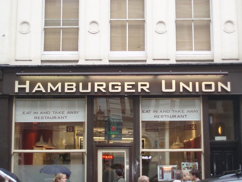
Now then, this is a bit of an experiment - it's not strictly grammar related but as Tom is well into typefaces I thought tickle his fancy and post this.
Bank Gothic has to be the most over-used typeface in the world. Ever.
You may have seen it recently adorning the credits and subtitles in the new Transformers film (which is amazing by the way), a setting where it is particularly suited as it implies a kind of nostalgic vision of the future. Like watching old episodes of Tomorrow's World in which a BBC presenter is claiming we will all live on the moon in 1995.
In fact, I can think of no other reason for using Bank Gothic unless you are Steven Spielberg or Michael Bay and you are making a film about a race of extraterrestrial robots based on a popular cartoon from the 1980s.
You certainly shouldn't use it as the sign for your hamburger restaurant.
Labels: bank gothic, photos, transformers, Typography
posted by Gez at 6:22 pm
![]()
![]()

Subscribe and Share


Previous Posts
Friends
- 1000 Tiny Things I Hate
- AA Gill's Times Column
- Apostrophe Abuse
- SPOGG
- Stephen Fry's blog
- The “Blog” of “Unnecessary” Quotation Marks
- Mighty Red Pen
- lowercase L
- Literally a web log
- Elisabeth Writes
- Never in all my life
- The Engine Room
- I Love Typography
- spEak You’re bRanes
- Passive Aggressive Notes
- T.E.A.L.
Enemies (aka The List)
Reading List
It's not just you


![]()

![]()
7 Comments:
Good stuff.
There's nothing particularly bad about Bank Gothic. It was designed in the 30s by a major type foundry - I suspect as a bit of an experiment (due to its fairly limited character set and variety of weights) - and from a typographical purist's point of view it's well-crafted and certainly very original.
The problem, as you point out, is its chronic, misguided and ignorant overuse.
Geek
I've always associated this font with prohibition-era America. Perhaps that's the feel that Hamburger Union is going for?
I have been reading and looking for Bank Gothic Burger and is amazing and disturbing how many blogs related to generic viagra are in the web. But anyways, thanks for sharing your inputs, they are really interesting.
Have a nice day
I believe everyone must look at this.
Nice post. I used to be checking continuously this blog and I’m impressed! Extremely useful information specially the final phase I maintain such info a lot. I was looking for this certain info for a very long time. Thank you and best of luck
biohealthchip |
ascotuw.co.uk |
http://www.lottonhealthcare.com |
elephantbeanbag.co.uk |
heroeshealthproject |
http://www.oregon-insurancelicense.com |
www.restaurant123.co.uk |
tutorial4designer.com |
http://www.housespouseandme.com |
www.laserbeautytips.com |
If you're seeking for a unique way to not only prevent baldness but regrow your hair as well, you should definitely take the time to examine the various foods that you're eating on a regular basis.
connectserviceswest |
http://www.wirelessronin.net |
www.camorhino.com |
kre8ivelance |
http://www.jabuconsulting.info |
Post a Comment
Subscribe to Post Comments [Atom]